Why Everything Looks the Same Now: The Great Flattening of the Internet

Why Everything Looks the Same Now: The Great Flattening of the Internet
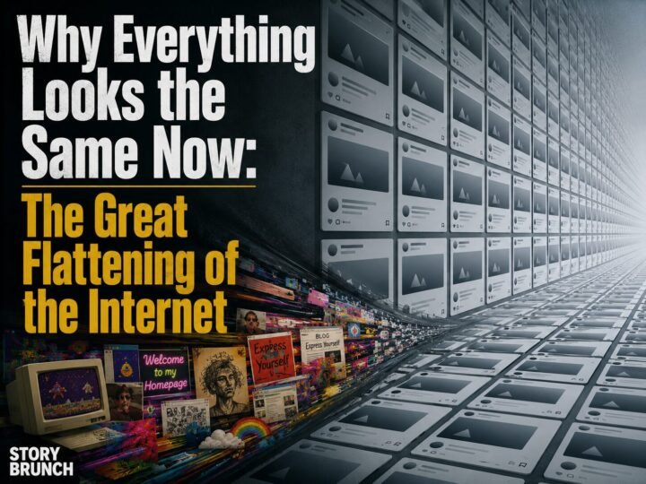
Same logos. Same faces. Same café in every city on earth. You’re not imagining it — and it isn’t a conspiracy. It’s an optimization result.
Start with your morning. The luxury fashion house whose logo was, within living memory, an ornate serif crest is now five geometric sans-serif capitals, indistinguishable from its four largest rivals, who made the same change within the same five years. The influencer on your feed — Los Angeles? Seoul? Lagos? impossible to say — has the face: lifted cat-eyes, pillowy lips, poreless sculpted cheeks, the composite that one writer famously described as a single cyborg face emerging across the world’s feeds. You get coffee. The café has white subway tile, hairpin-leg oak tables, hanging philodendrons, and a hand-lettered menu — and it is, fixture for fixture, the same café you sat in on another continent last year. Your phone’s apps greet you with identical rounded-square gradients. The onboarding screens all feature the same bendy-limbed flat cartoon people. Even the new thriller you downloaded has the cover — a big lowercase title over abstract color blobs — that every thriller has had since roughly 2018.
At some point, you noticed. Everyone noticed. The internet promised infinite variety and delivered a single, tasteful, sage-green average — and the strangest part is that no one decided this. There is no committee of beige. There are only millions of independent people, each making the locally sensible choice, all converging on the same global sameness.
This piece is about the machine that does that. It has four engines, a long prehistory, an honest defense — and, if you look closely at the edges of the culture, a revolt already underway. The design of this very page will make the argument alongside the words: we begin in the gray, and we will not stay there.
The short answer, before the long one
The Great Flattening is the observed convergence of global visual culture — logos, interiors, faces, products, layouts — toward a single minimalist average. Writers have named its fragments: critic Kyle Chayka called the identikit global coffee-shop style “AirSpace” and later traced the algorithmic version in his book Filterworld; Jia Tolentino documented “Instagram Face” in The New Yorker; designers dubbed the mass logo simplification of the 2010s “blanding.”
The mechanism is not taste — it’s optimization. When millions of actors compete under the same filters (engagement algorithms, A/B tests, global legibility, risk-averse capital), they converge on whatever survives every filter, and what survives every filter is the inoffensive average. Flatness isn’t a style that won an argument. It’s the residue left when every argument is settled by a metric.
The four engines of flattening
Nobody chose beige. Beige is what’s left after four separate selection pressures finish voting. Each engine is individually rational; the sameness is their compound interest.
Engine 1 — The algorithm
Feeds don’t distribute content; they distribute proven content. An engagement-ranked feed shows you more of what people like you already responded to, which means creators — whose livelihoods ride on distribution — reverse-engineer whatever worked last week. The result is a culture-wide regression to the mean: every thumbnail converges on the tested face-plus-arrow, every reel adopts the retention-optimized hook structure, every room designed to be photographed adopts the palette that photographs well. Chayka’s Filterworld argument in one line: when an algorithm mediates culture, culture optimizes for the algorithm. Variance is a distribution risk, and the feed punishes risk.
Engine 2 — The A/B test
Modern design is not argued into existence; it is measured into existence. Every button color, headline weight, and layout is split-tested against conversion, and here is the trap: everyone’s users click the same buttons. Run ten thousand independent A/B tests across ten thousand companies and you don’t get ten thousand aesthetics — you get one, because the tests are all sampling the same human reflexes. Data-driven design is convergent by construction. The spreadsheet never votes for the weird option, because the weird option’s payoff — memory, meaning, brand distinctiveness — accrues over years, and the test ran for two weeks.
Engine 3 — The global market
A logo that must work in forty languages, three alphabets, and two hundred app-icon sizes sheds every cultural particular it has. Serifs, ornament, regional reference, wit — all of it is friction at global scale. Flatness is not just a style; it is a translation layer, the visual equivalent of simplified English. The ornate crest said “we are from somewhere.” The geometric sans says “we render legibly everywhere” — which is another way of saying “we are from nowhere,” and nowhere, it turns out, has excellent unit economics.
Engine 4 — Risk-averse capital
The 2010s startup wave shipped a recognizable costume — friendly rounded sans, muted gradient, bendy-limbed illustration people, a name like a dropped-vowel noise — because the costume wasn’t designed for customers. It was designed for investors, acquirers, and app-store trust at a glance. Design researchers and critics who anatomized the “millennial aesthetic” and corporate “blanding” kept finding the same logic underneath: when money is deciding fast, looking like the last success is the cheapest possible insurance. Distinctiveness reads as risk on a pitch deck.
The Flattening Gallery
Ten exhibits. Each card is a stylized abstraction — the shape of the trend, not any one brand — with the engine that did it. Toggle between THEN and NOW.
Method note: every exhibit is a drawn abstraction of a documented trend — the geometry of the pattern, not a reproduction of any brand, book, film, or person. That’s both a legal courtesy and the point: the pattern is visible even in cartoon form, which tells you how strong it is.
Flat is not stupid
Now the part a lesser version of this essay would skip: the flattening delivered real goods, and pretending otherwise is nostalgia doing analysis’s job.
Flat design is more legible at small sizes, faster to load, and vastly more accessible — high-contrast simplicity is genuinely kinder to aging eyes, cheap phones, and slow connections than ornamental clutter ever was. The minimalist interface reduced the cognitive tax of computing for a few billion people who never asked to become power users. Template tools like the drag-and-drop site builders and Canva did to design what literacy campaigns did to writing: they made a professional-adjacent competence nearly universal. The old world of distinctive design was also a world where distinctiveness cost money most people didn’t have. A flattened visual culture is, among other things, a democratized one.
And the individual choices were never irrational. The café owner who installs the subway tile isn’t a sheep; she’s read the same photos everyone has and knows what customers photograph. The founder who buys the friendly sans isn’t a coward; he’s seen what happens to pitch decks that look unfamiliar. This is the uncomfortable structure of the whole phenomenon: it’s a tragedy of the commons where the commons is variety. Each rational choice to converge raises the cost of deviating for everyone else, until deviation reads as error. Nobody defected; the equilibrium just closed over everyone’s heads.
We’ve flattened before
If the pattern feels like it must be new, it isn’t — only the speed is. In 1908 the architect Adolf Loos declared ornament a crime, and within a few decades the International Style had replaced the world’s wildly regional architecture with the same glass box in every financial district on earth — modernism as the original global template. Broadcast radio and television flattened accents and regionalisms into a standard announcer voice. Every efficiency technology in history has traded local texture for universal function; the “traditional” visual richness we mourn was itself once the flattener of something older. What’s different now is the feedback loop: the International Style took forty years to conquer skylines. An aesthetic on the feed conquers the world in eighteen months, because this time the selection happens per-scroll, billions of times a day.
The pendulum, already moving
You are reading this section in different typography than the one you started in. That was the plan — and it’s also the forecast.
The signals of a counter-swing are accumulating at the culture’s edges. Design writers have spent the last few years documenting the return of the serif: brands that blanded in the 2010s quietly reintroducing character, warmth, even crests. Interiors media chronicle “cluttercore” and the maximalist revival — rooms that look lived-in as a rebuke to rooms that look listed. “De-influencing” became a genre. Analog objects — film cameras, vinyl, dumbphones — keep outgrowing their nostalgia niches with buyers too young to be nostalgic. None of these is decisive alone; together they rhyme with every previous cycle, because ornament has always returned after each purge — the Victorians followed the Georgians, postmodernism followed the glass box.
But this swing has a new accelerant. Generative AI has made the average free. When any prompt yields competent, frictionless, industry-standard blandness in four seconds, competent blandness stops being worth anything — the signaling economics invert overnight. The safe choice used to signal professionalism; increasingly it signals that nobody was home. Visible human decision — the weird choice, the ornament, the texture, the thing an optimizer would have sanded off — becomes the new proof of life, and therefore the new luxury. The flattening machine hasn’t stopped running. It’s just started manufacturing the one thing it can’t help but make abundant: a reason to want its opposite.
Which returns us, one last time, to the question of who benefits from you never noticing any of this. An aesthetic that presents itself as neutral, natural, and inevitable — merely “clean,” merely “modern” — is making the oldest move in the persuasion playbook, the same one we anatomized when an ideology dressed itself in linen: the claim that there is no claim. There is always a claim. Sometimes it’s just wearing gray.
Questions this piece gets asked
Why do all logos look the same now?
Because they were optimized against the same constraints: legibility at app-icon sizes, rendering across scripts and screens, and risk-averse approval processes. Geometric sans-serif wordmarks survive all three, so fashion houses, banks, and startups converged on them independently — a phenomenon design critics dubbed “blanding.” Nobody copied anybody; everybody passed the same tests.
What is Instagram Face?
A term popularized by Jia Tolentino’s 2019 New Yorker essay for the single, ethnically ambiguous, filter-optimized face — lifted eyes, full lips, sculpted cheeks — converging across influencers worldwide. Filters preview the look, feeds reward it, and cosmetic procedures make it permanent: a face optimized for the camera that was optimized for the feed.
What do “AirSpace” and “Filterworld” mean?
Both are critic Kyle Chayka’s coinages. AirSpace (2016) names the interchangeable global aesthetic of cafés, co-working spaces, and rentals — white walls, raw wood, hanging plants — that lets a “digital nomad” travel the world without ever leaving the same room. Filterworld (his 2024 book) names the wider condition: culture homogenized by algorithmic recommendation.
Is minimalist design bad?
No — and that’s what makes the flattening interesting. Minimalism is more legible, accessible, faster, and cheaper to produce, and template tools democratized design competence. The problem isn’t any single flat choice; it’s the compounding loss of variance when every actor optimizes against the same metrics. The costs are collective even when every individual choice is sound.
Is the maximalist comeback real?
The signals are real: documented serif revivals in branding, the cluttercore and maximalist interiors wave, de-influencing, and analog resale growth. The structural argument is stronger than any trend piece, though: generative AI makes average output free, which collapses the signaling value of polished blandness and puts a premium on visibly human, unoptimized choices. Scarcity moved.
Sources & further reading
- Chayka, K. (2024). Filterworld: How Algorithms Flattened Culture; and “Welcome to AirSpace,” The Verge (2016).
- Tolentino, J. (2019). “The Age of Instagram Face,” The New Yorker.
- Loos, A. (1908/1913). “Ornament and Crime” — the manifesto of the first great flattening.
- Bloomberg Businessweek (2019) and subsequent design-press coverage of “blanding” and the sans-serif luxury-logo wave.
- Coverage of “Corporate Memphis”/”Alegria” illustration style and its critics in the design press.
- Reporting on streaming-era songwriting structure (front-loaded choruses, shrinking intros) in the music trade press.
Related on Story Brunch