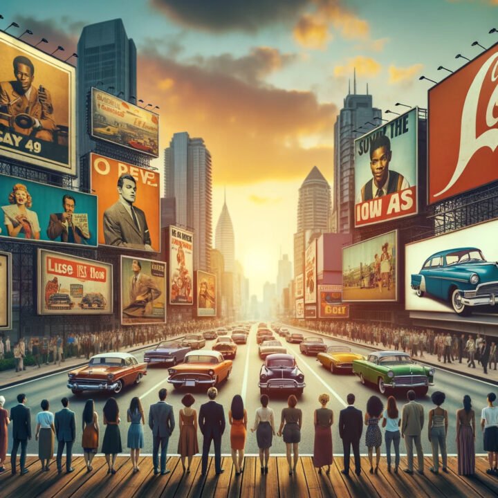
DALL·E 2023-10-31 23.25.05 - Photo of a busy urban street at sunset, with various iconic billboard ads from different eras standing tall. People of diverse descent and gender look
Billboard advertising has been an integral part of marketing strategies for many brands. Over the years, some billboard ads have left an indelible mark due to their creativity, impact, and the way they resonate with the audience.
In the dynamic field of marketing and advertising, staying creative and innovative is not just a requirement but a necessity. To thrive in this realm, drawing inspiration from successful campaigns is a tried-and-tested method for sparking new ideas and refining one’s skills. This article is crafted to serve as a source of inspiration by showcasing 15 brilliant billboard ads that have left a significant mark in the history of media. By delving into these exemplary works, readers will not only appreciate the boundless creativity that the advertising industry has witnessed over the years but also glean valuable insights to aid in the development of their marketing and advertising skills. Each ad listed exemplifies a unique approach to capturing the audience’s attention and communicating a brand’s message effectively. As we journey through these creative masterpieces, take note of the diverse techniques employed, and envision how you can incorporate such ingenuity into your future advertising endeavors.
Here are 15 of the best billboard ads in the history of media, with links to their images for a visual treat:
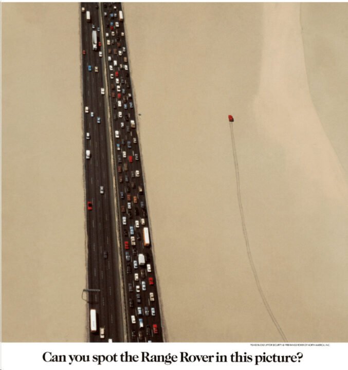
1. Range Rover's Off-Road Mastery: A Picture Worth a Thousand Words
This brilliant Range Rover advertisement capitalizes on the contrast and differentiation technique. At first glance, the viewer notices a congested highway juxtaposed against a serene, uninterrupted desert landscape. The solitary Range Rover traversing the sand represents freedom, capability, and the ability to rise above the mundane. By placing the vehicle away from the traffic, the ad makes a clear statement about the Range Rover’s off-road capabilities. Furthermore, the ad subtly challenges the viewer with the caption, “Can you spot the Range Rover in this picture?”, turning the viewing experience into an engaging game. This interactive element ensures longer engagement with the ad, reinforcing the brand message and leaving a lasting impression. Through this imagery, Range Rover establishes itself not just as a car, but as an emblem of unconventionality and unparalleled adventure.
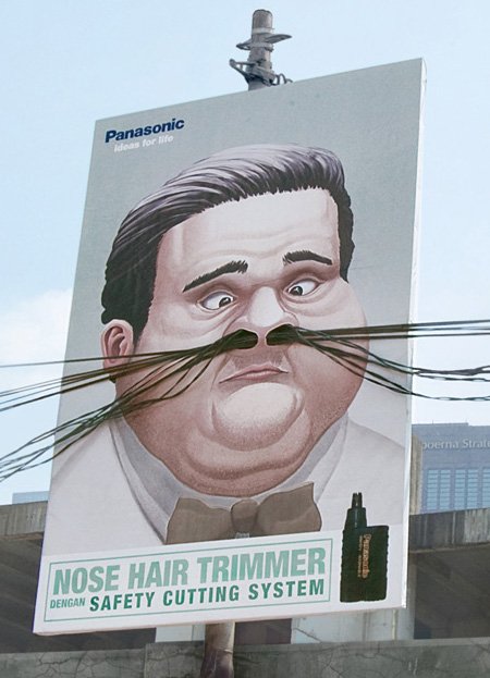
Panasonic’s billboard ad brilliantly uses visual humor to convey the efficacy of its product. By having actual wires protrude as exaggerated nose hairs from the illustrated man’s nostrils, the ad offers a playful yet stark visual representation of the problem the product aims to solve. This masterstroke not only captures attention but also drives home the message in an unforgettable manner. Moreover, the technique of interactive advertising—where real-world elements blend seamlessly with the advert’s design—ensures engagement and recall. Panasonic underscores the principle that sometimes, a touch of humor and clever integration with the environment can elevate a product advertisement from mundane to memorable, ensuring the brand’s message resonates long after the first glance.
3. FORMULA Toothpaste- Using Real World Elements for Maximum Impact
This innovative billboard advertisement for Formula toothpaste is a masterclass in three-dimensional integration. Instead of merely presenting a visual, the ad cleverly incorporates the billboard’s physical support structure to depict the strength of teeth. This design approach not only captures attention but also drives home the product’s value proposition: building strong teeth. By having the depicted individual “bite” onto the metallic structure, the advertisement goes beyond conventional two-dimensional constraints to deliver its message, creating a memorable visual that resonates with viewers. Such immersive advertising blurs the boundaries between the advertisement and the real world, making the product’s benefits tangibly evident. This billboard exemplifies the potential of creative out-of-the-box thinking in making a brand message unforgettable.
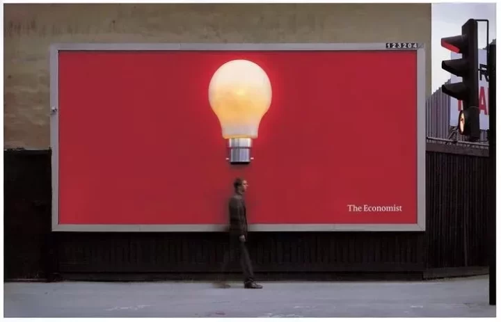
4. The Economist's Illuminating Insight: Minimalism with Maximum Impact
PC- “Lightbulb” by Abbott Mead Vickers BBDO for The Economist
The Economist’s billboard perfectly exemplifies the power of visual simplicity. With just a solitary, illuminated light bulb against a bold red background, the ad communicates the idea of sudden insight, knowledge, and enlightenment – attributes associated with the thought-provoking content The Economist delivers. This minimalistic approach allows for immediate brand association without overwhelming the viewer with excessive details. Additionally, the physical light bulb on the billboard is not just a printed image; it actually lights up, symbolizing a sudden “aha” moment. This ingenious use of interactive elements in a traditionally static medium grabs attention, making the message both memorable and engaging. Here, The Economist brilliantly shows that sometimes less truly is more, especially when punctuated with a bright idea.
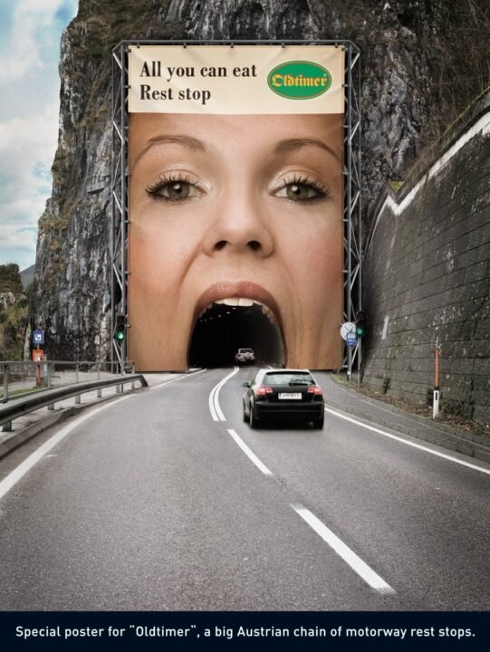
5. Oldtimer's Genius Blend: Visual Drama Meets Practicality
Oldtimer’s advertisement showcases the potency of visual storytelling. By ingeniously blending the tunnel’s entrance with a gigantic human mouth, it does more than just communicate the message—it dramatizes it. The concept of “All you can eat” gets a literal, oversized representation, ensuring it’s not only seen but also remembered. The ad harnesses the power of environmental integration, making the most of its physical context. This approach creates an immediate and impactful connection with the viewer, amplifying recall and reinforcing brand identity. Such innovative placement serves as a reminder: advertising is not just about what you convey, but also how and where you present it. By merging artistry with the environment, Oldtimer establishes an unforgettable narrative, making a pit stop more tempting than ever before.
6. POND'S Revealing Campaign: Power of Simplicity and Relatability
POND’S billboard ad offers a classic example of visual storytelling. The act of a woman pulling a cloth over her face immediately resonates with the audience, symbolizing the concealment many feel the need to do due to skin imperfections. This clever visual metaphor addresses a common insecurity, making the ad deeply relatable. The backdrop of the clean white sheet alludes to the purity and freshness that the product promises. Moreover, the ad employs the less-is-more philosophy—by using minimal text and a clear visual, it effortlessly conveys the product’s benefits without overwhelming the viewer. This POND’S advertisement stands as a testament to the power of understanding the consumer’s psyche and designing a visual narrative that directly speaks to their emotions and needs.
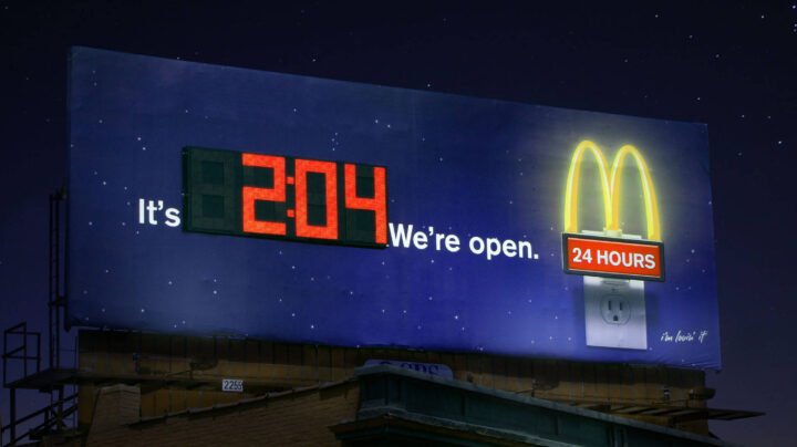
7. McDonald's Midnight Glow: Seamless Integration of Message and Medium
This McDonald’s ad brilliantly showcases the power of contextual advertising. By embedding the actual time into its billboard, it emphasizes the brand’s 24-hour service commitment in real-time. The message, “It’s 2:04. We’re open,” is direct and resonates with late-night commuters and those looking for a late-night snack, thereby creating a moment of relevance. Additionally, the clever use of the glowing iconic golden arches symbol, resembling a nightlight plugged into an outlet, adds a touch of humor and draws attention, reiterating the brand’s unwavering presence. This billboard embodies a perfect synergy between message clarity, brand recall, and environmental context, reminding consumers that McDonald’s is always there, no matter the hour.
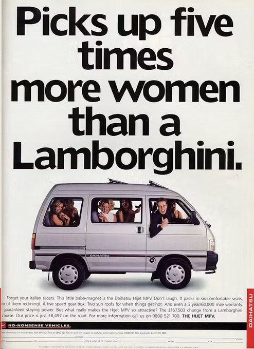
8. Subverting Expectations: The Genius Behind the Daihatsu Hijet MPV Ad
In a brilliant play on luxury car stereotypes, this Daihatsu Hijet MPV advertisement uses humor and surprise to convey its message. By juxtaposing the modest-looking MPV with a high-end car brand like Lamborghini, the ad cleverly subverts the viewer’s expectations, suggesting that the MPV can “pick up” five times more women, thanks to its spaciousness. The ad underscores the notion that while luxury cars might be great for flaunting status, practical cars have their unique charm and advantages. This form of contrast marketing not only grabs the viewer’s attention but also instills a memorable message: sometimes, practicality can be more appealing than luxury. The ad teaches brands the power of using humor to challenge industry norms and make a lasting impression on consumers.
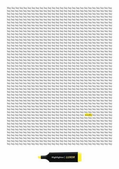
9. Standing Out in a Sea of Repetition: LUXOR's Striking Visual
Amidst a dense repetition of the word “hay,” LUXOR’s advertisement offers a visually stunning and direct representation of what their highlighter can do—spotting and emphasizing what’s truly important. By presenting a singular, highlighted “needle” in a haystack of text, the ad taps into the familiar idiom of “finding a needle in a haystack,” giving it a literal twist. This strategy harnesses the power of visual storytelling, where the medium itself becomes the message. Viewers immediately grasp the efficiency and precision of the LUXOR highlighter without being bogged down by excessive text or complicated visuals. The genius lies in its simplicity, teaching brands the value of letting the product speak for itself and using universally understood idioms to make an immediate connection with the audience.
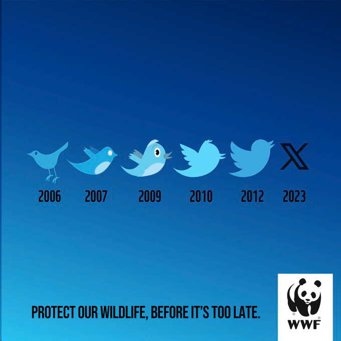
10. WWF's Strategic Resonance: Leveraging Pop Culture for a Cause
WWF’s ad demonstrates the brilliance of cultural integration, skillfully weaving the evolution of Twitter’s iconic logo with an underlying message about wildlife extinction. This visual progression serves dual purposes: it captures attention with its playful nod to a well-known brand, while simultaneously emphasizing the seriousness of its conservation message. By 2023, the once familiar bird is marked extinct, echoing the sobering reality many species face. The ad underscores the fact that, just as logos can evolve and fade, so too can the irreplaceable wonders of nature. WWF’s tactic of connecting pop culture with an urgent call-to-action illustrates the power of contextual relevance in driving a message home. This integration ensures not only high recall but also elicits an emotional response, urging viewers to take immediate action.
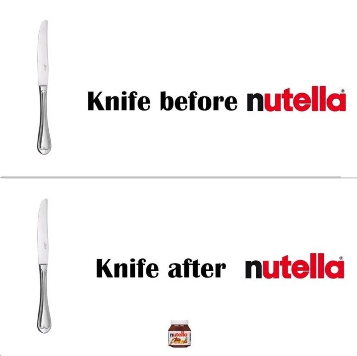
11. Nutella's Subtle Genius: Transforming Simplicity into Desire
Nutella’s ad stands as a testament to the power of minimalistic design and the effectiveness of conveying a message without overt visuals. The untouched knife before Nutella and the implied empty jar after its use brilliantly convey the irresistibility of the product. This imagery evokes a universal experience shared by Nutella lovers – the uncontrollable urge to scoop out every last bit. By juxtaposing two simple scenarios, the ad taps into the viewer’s emotions and cravings, proving that sometimes less really is more in capturing the essence of a brand’s appeal. The clever integration of the brand’s name into the narrative further cements Nutella’s presence in the consumer’s mind, reminding them of the joy of indulging.
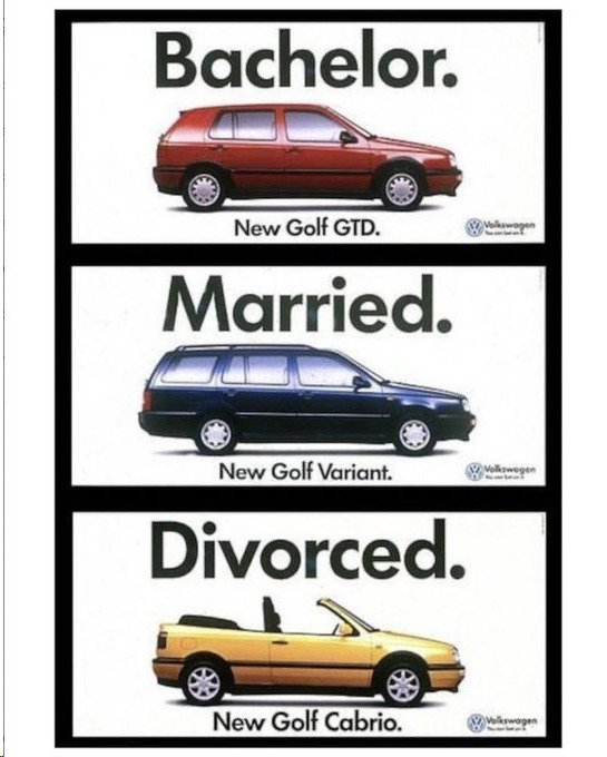
12. Life's Phases and Smart Car Choices: The Volkswagen Way
Volkswagen’s clever ad plays on the evolution of personal life stages and the corresponding shift in vehicular preferences, making it both relatable and humorous. Starting with the compact car for the free-spirited bachelor, moving to the spacious family car for the married phase, and finally showcasing the flashy convertible for the newly single individual, the ad humorously suggests that for every significant life event, there’s a Volkswagen to match. This segmented targeting approach not only appeals to a wide demographic but also fosters a deeper brand connection, subtly implying that Volkswagen understands and caters to the changing needs of its customers throughout their life journey.
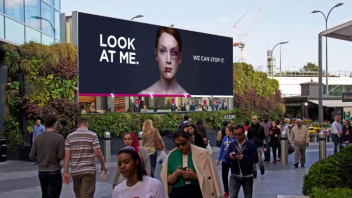
13. Demanding Attention: The Power of Urgency in Visual Storytelling
This ad harnesses the raw emotion of a visceral visual coupled with an authoritative message, demanding viewers’ immediate attention. The bold text “LOOK AT ME” serves as a direct call-to-action, ensuring that pedestrians engage directly with the image of the bruised woman. The message is clear and jolting: the urgency of addressing domestic violence. Additionally, the strategic placement of the billboard in a high footfall area underlines the importance of location in advertising, ensuring maximum visibility and impact. By juxtaposing the stark image against the bustling city backdrop, the ad highlights the often overlooked issue amidst our daily lives, urging viewers to not only notice but also take action with the hopeful note, “WE CAN STOP IT.”
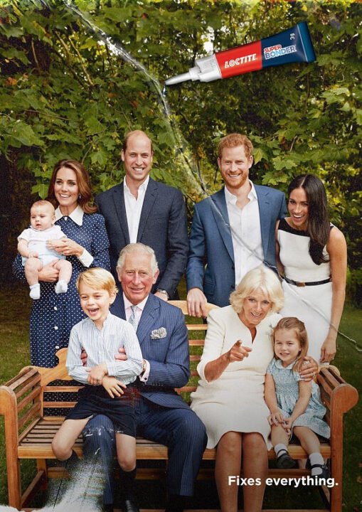
14. Loctite's Creative Ad: Mending Bonds with a Touch of Wit
Loctite’s ad brilliantly merges cultural relevance with a touch of humor, making it stand out in the world of billboard ads. By featuring a well-known family and associating it with the tagline “Fixes everything,” the brand effectively communicates the powerful adhesive properties of its product while infusing a deeper message of mending relationships. The clever juxtaposition resonates with viewers, showing that effective advertising isn’t just about showcasing the product, but intertwining it with a narrative that captures emotions and garners attention. Additionally, the visual play between the image and the brand logo ensures that the viewer’s focus remains on the product, emphasizing its significance in the presented scenario.
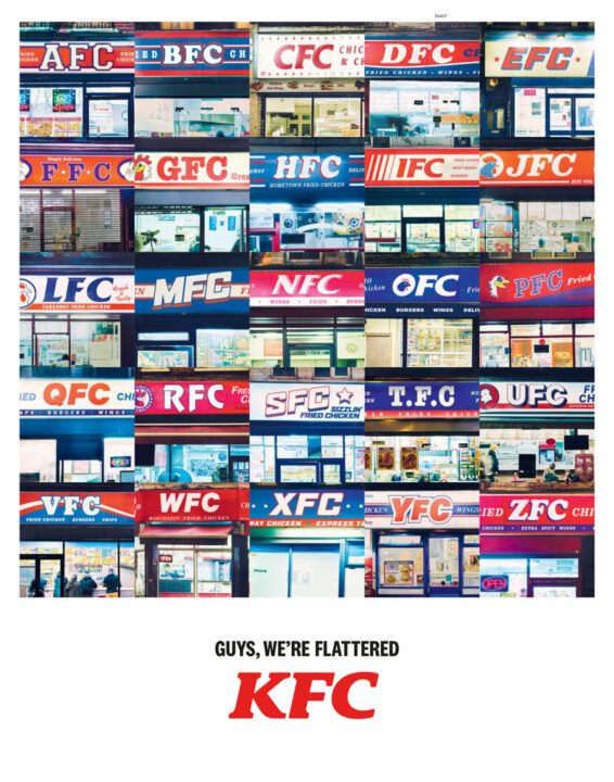
15. Turning Imitation into Recognition: KFC's Genius Approach
Image courtesy of Newsworks.
In a world rife with brand imitations, KFC’s advertisement stands out by leaning into the phenomenon rather than fighting it. This ad showcases a montage of storefronts, each a slight variation on the iconic “KFC” name. Instead of condemning these imitations, KFC cleverly uses the tagline, “Guys, we’re flattered.” This tactic highlights the brand’s undeniable influence in the fast-food industry. The ad reminds viewers that imitation is the sincerest form of flattery, reinforcing KFC’s position as the original and most iconic fried chicken brand. By addressing brand mimics with humor and confidence, KFC not only establishes its legacy and authenticity but also makes a lasting impression with its playful acknowledgment. This approach emphasizes the importance of brands staying self-assured, innovative, and always a step ahead in the marketing game.